Thursday, 17 March 2016
The Final product: SHOOP
Thanks to Tyler, Grace and Elisa for putting in all the hard work; big up SHOOP.


Wednesday, 16 March 2016


Monday, 22 February 2016
Script and Task 4:How did you use new media technologies in the construction and research, planning and evaluation stages
Tyler: We did various screen tests for our music video to ensure that all of our actors looked comfortable in front of the camera. Furthermore, we wanted actors with a specific look, such as the artist Kelis in the 90’s.
Elisa: This ensured that
on the day there were no disappointments in the actual performance.
Ollie: We made sure that
there was always direct communication between members of the production team
and our actors, which we did through Facebook.
Grace: The outcome of this
better organisation was that we ended up with three girls who had the right
look and skills for our artist.
Tyler: During the
production of my A2 pop video, we had an Ipad on set, which acted as a digital
clapperboard.
Elisa: This was extremely useful as it made our jobs in the
edit suite much easier because it meant that we were able to sync all of our
performance footage from the rush bins on the timeline using the audio queue
from clapperboard, which enabled me to create a complex cut of the music video.
Ollie: Furthermore, we had a playback monitor in the form of
a plasma screen television.
Grace: What this
helped with was that while one of the members of my group was filming, I was
able to look at the monitor to see exactly the shot would look like. This gave
us an idea of how much we would have to do in the edit suite.
Tyler: From this I could then call a cut because someone had
entered the shot, or if there was a problem with continuity, etcetera. It
therefore meant that we had all the shots we wanted, but also that none of the
shots were corrupted with any of the things I mentioned above.
Grace: We used two
different cameras, a Sony NX5 for the hand held shots because it is light and
easy to manoeuvre around the set. We used a Sony FS100 with a prime lens for
the rooted, tripod shots when the composition was important. This helped to
keep a good quality of shallow focus, as with an integrated lens the focus
shifts about too much.
Elisa: I began
post-production by starting a lossless copying of the footage to HD on Adobe
Prelude.
Ollie: Then I began to
sort all of the rushes into a single bin on Adobe Premier. Once this was
completed, I worked onto the timeline, syncing all of shots to the clapper
board track so cutting the shot with the razor blade wouldn’t ruin the lip
sync.
Tyler: This left us with
plenty of different layers all in sync to the track. We used the razor blade
tool to cut into each layer on the beat, using markers so as to show me where
the cutting point was.
Grace: Having done this I
was able to drop the best cuts from each one on top of the main performance
cut. I created the text animation, where we made a text layer, and began to
font scale.
Elisa: We chose the font
from dafont.com. To do this, the key frame would start at 0% and end at 100%,
causing the font to grow as the computer acts as the inbetweeners.
Ollie: I needed to use
the select tool in order for the animation not to be blocked by a moving arm;
this masked it out by drawing a line around the object, and then cut it out.
Tyler: I had to
chroma-key, animate text and changing the aspect ratio. I used Adobe After
Effects to do it all, and it began with myself exporting all desired footage
into the programme.
Grace: Chroma keying with
the green screen meant matting everything out, then it was easy to replace the
black with a still image.
Elisa: We worked on
colour with Lumetri Colour Engine, which works inside premier. This let me
control the amount that specific colours feature.
Ollie: I worked on
desaturating and saturating, this was to get rid of the black colouring in each
shot.
Tyler: I desaturated the
reds in each shot, which helped to give a 1980’s/90’ muddy and messy light,
which propelled it into the period product look even further.
Friday, 5 February 2016
Task 2:How effective is the combination of your main product and ancillary texts
How effective is the combination of your main product and ancillary texts?
The terms "pop performer" and "pop star" have become interchangeable — strictly speaking, in media terms they are not the same thing. The study of stars as media texts/components of media texts demands that the distinction be made between those who are simply known for performing pop music and those who are known for being pop stars, who have an identity or persona which is not restricted solely to their musicianship.
- In order to understand the relationship between the industry and its audiences, it is important to consider the roles of music stars.
- The term ‘star’ refers to the semi-mythological set of meanings constructed around music performers in order to sell, the performer to a large and loyal audience.
- Dyer has written extensively about the role of stars, in film, TV and music.
- irrespective of the medium stars have some key features in common, which are; A star is an image not a real person that is constructed out of a range of materials. (advertising mags etc).// Stars are commodities produced and consumed on the strength of their meanings.
- Stars depend upon a range of subsidiary media (mags TV internet etc) - In order to construct an image for themselves, which can be marketed to their target audiences
- The star image is made up of a range of meanings which are attractive to the target audiences.
- Common values of music stardom - Youthfulness, Rebellion, Sexual magnetism, Attitude.
- Fundementally the star image is incoherent, that is incomplete and ‘open’, Dyer says this is because it is based on two key paradoxes
1). The star must be simultaneously ordinary and extra ordinary - Lazy Rymz - Urban set - with friends - Costume, sass - DJ set
2). The star must be simultaneously present and absent for the consumer - posters, video, interview - not fully embodied - concert (be with them)
Digipak
- Using different backgrounds
- Bright and vibrant colours
- Outlining the girls and making them stand out- this also creates a retro hip-hop 90’s look.
- Positioning of the girls- canted angles- adhering to stereotypes
Website
we also had to use the star image theory on our website, we realised that we had already got across the serious aspect of our groups image, with links to female independence. So for the website we kept this but we wanted to show there was another side to their image, which is more fun side, we helped get this through using a lot of colourful design within the website, for example the front page of the site, is the three girls looking serious, but surrounded by a load of abstract colourful lines, which is a similar style to something that KidnPlay used to use. Also to get the image across on the band page, there is a little back story to each of the girl, all of which highlight the classic background that RnB artists would come from in the 90’s. This is further shown within the gallery of photos, especially by one which shows the girls standing over the city of Brooklyn.
- bold image
- Sense of sass and attitude
- Bright vibrant colours
- Different shapes and patterns
- Clear layout
- Youthful and fun description of the girls.
- Urban vibes
Music Video
Through using Richard dyers theory of star image we were able to construct a group that we thought matched what was needed. Using both the lyrics and visuals within our music video we were able to portray our artists, as a group of strong independent woman, which was a common theme within 90’s RnB with reference to examples such as, independent women –Destiny’s Child and girl talk by TLC. An example of the shot which arguably highlights would be when the main artist is sitting on the sofa with everyone, in the centre of the shot, holding on her lap the boombox on her lap highlighting that she has control over it. Moreover, as a 90’s RnB group to fit the star image of this genre, we used a lot of bright and flashy colours within the video, such as the gel screened panels as one of the sets. Also the girl’s costumes, all of which were brightly coloured helped get this part of the image through, and you can see a similar style of costume used in Destiny’s Child music video for the song Nasty Girl. Through the use of star image, we were able to create a both successful and creative music video, which allowed us to achieve our desired 90’s RnB themed music video.
Thursday, 4 February 2016
Thursday, 3 December 2015
Editing: 3rd December
Today we went up to the edit suit and all of the green screening was finished and we had achieved exactly what we wanted, we had a city skyline scene which worked and looked just as authentic as we needed. Not only this but the majority of the animations of wording was finished as well and fit into the video and looked good and helped create the retro theme that we were after. Also the colour grading was all finished as well and all the colours looked the same on each shot, which helped our music video look a lot better and more professional.
One other change that we made was that we put our video into 4:3 format to also help fit in with the retro 90's theme. However perfecting this took time as the shot had to be moved to the centre of the screen each time in order to create the focus on whoever was at the front, but after a while this was finally done
Now all we need to do is add a few more animated words and then we are there and will have finished the editing process of our music video.
Thanks for the post, Tyler.
One other change that we made was that we put our video into 4:3 format to also help fit in with the retro 90's theme. However perfecting this took time as the shot had to be moved to the centre of the screen each time in order to create the focus on whoever was at the front, but after a while this was finally done
Now all we need to do is add a few more animated words and then we are there and will have finished the editing process of our music video.
Thanks for the post, Tyler.
Wednesday, 2 December 2015
Editing: 2nd December
Finally after finishing all the performance pieces of the video it was time to start adding the animatics which is something we had all been anticipating.
For example one of the things we added animatics to, was the first shot of our video. In which the girls were in the background and in the foreground was the boombox, from which we animated the words 'heyyyy yeahhhhh, i wanna shoop baby' coming out of it. Then we added a few more to other shots.
We had the same font and colour for all of the animations, the font being Diego Con and the text being block white. However they can in at different angles and what not. We chose to put around 7 animations into the video, all on different shots to help create an emphasis. But on the one with the phone number popping out, we are unsure of it and aren't positive that it works very well.
Then we went onto colour grading, which we are using in order to even out the colours and help again give our video a more of a retro feel. However this was a hard job as much of the lighting was different so it was hard to get all of the colours the same.

Overall its been a very busy morning which has taken up a lot of time, as we also had to make the green screen perfect, with an appropriate background which fits the theme and had to change the white and black balance to avoid any shimmering outlines.
Thanks for the post, Tyler/
For example one of the things we added animatics to, was the first shot of our video. In which the girls were in the background and in the foreground was the boombox, from which we animated the words 'heyyyy yeahhhhh, i wanna shoop baby' coming out of it. Then we added a few more to other shots.
We had the same font and colour for all of the animations, the font being Diego Con and the text being block white. However they can in at different angles and what not. We chose to put around 7 animations into the video, all on different shots to help create an emphasis. But on the one with the phone number popping out, we are unsure of it and aren't positive that it works very well.
Then we went onto colour grading, which we are using in order to even out the colours and help again give our video a more of a retro feel. However this was a hard job as much of the lighting was different so it was hard to get all of the colours the same.

Overall its been a very busy morning which has taken up a lot of time, as we also had to make the green screen perfect, with an appropriate background which fits the theme and had to change the white and black balance to avoid any shimmering outlines.
Thanks for the post, Tyler/
Tuesday, 1 December 2015
Audience Feedback: Pop Video 2015
Feedback on both the rough cut and the final cut before special effects:
Monday, 30 November 2015
Further editing: Special effects on Adobe programmes
Having finish the final cut for our pop video, I, Oliver Tennant was tasked with creating the special effects for the video.
I was unable to actually begin creating the animations yet due to issues around font, which I will explain later on. Instead, I learnt how to take out the green from our green screen shots. When Matt first explained to me how I could do this, I was slightly confused and thought 'Oh God this could take a while', however I paused and thought about it, and really it is rather simple. All I had to do was press Alt and drag the clip I wanted to work on up to duplicate it, right click and disable the clip. This was so that if it turned out that I didn't like the changes I was about to make I could very easily go back a start again. Next I would right click again and click, 'export to Adobe special effects'. This took me into a seperate application where I would click an option that would highlight the green, then I would check it in Screen Matte, this would show me the whites and blacks. I would make sure that everything I wanted visible in the shot was white, and the green screen was black. Once I had done this I would go back to previous section of what was now hopefully, everything that was there originally but now a black screen. I did this with all 15 of our green screen shots, and already the video was looking better and I am very much looking forward to adding our background of the Los Angeles Skyline at night.


Now adding the special effects is not a simple task, and I decided to begin with searching the worldwide web for the appropriate font. Now, following a recomendation from Matt, I went onto the website Dafont.com.

On here I was able to type out the sentence I would like, so that when I looked through the hundreds, maybe even thousands of fonts available I would be able to get a clear and approximate view of what it would actually look like on screen. I decided to go with "I want to Shoop Baby"
I did this, and decided that catagory wise my best bet was to search through the 'comic' section. On entering this I was faced with a whole spectrum of different comic looking fonts. On trawling through these I struggled to make a decision as it was after all quite a big one to make without the help from my group, therefore I made a short list of seven, in which I have a favourite, so here they are.
I am also going to give a brief insight into my thought processes I had when short listing some of them.
Number 1: I feel that this one is nice, however the fuzz around it may make it harder to read, which could be a real problem as the words will not appear on screen for a particularly long time.
Number 2: This one is also nice, however I don't think that it is 80's enough and could appear tacky
Number 3: I love this one and it is in fact my favourite. It is clear, easy to read, and is slightly wonky, giving it that 80's look.
I was unable to actually begin creating the animations yet due to issues around font, which I will explain later on. Instead, I learnt how to take out the green from our green screen shots. When Matt first explained to me how I could do this, I was slightly confused and thought 'Oh God this could take a while', however I paused and thought about it, and really it is rather simple. All I had to do was press Alt and drag the clip I wanted to work on up to duplicate it, right click and disable the clip. This was so that if it turned out that I didn't like the changes I was about to make I could very easily go back a start again. Next I would right click again and click, 'export to Adobe special effects'. This took me into a seperate application where I would click an option that would highlight the green, then I would check it in Screen Matte, this would show me the whites and blacks. I would make sure that everything I wanted visible in the shot was white, and the green screen was black. Once I had done this I would go back to previous section of what was now hopefully, everything that was there originally but now a black screen. I did this with all 15 of our green screen shots, and already the video was looking better and I am very much looking forward to adding our background of the Los Angeles Skyline at night.


Now adding the special effects is not a simple task, and I decided to begin with searching the worldwide web for the appropriate font. Now, following a recomendation from Matt, I went onto the website Dafont.com.

On here I was able to type out the sentence I would like, so that when I looked through the hundreds, maybe even thousands of fonts available I would be able to get a clear and approximate view of what it would actually look like on screen. I decided to go with "I want to Shoop Baby"
 |
| 1 |
I am also going to give a brief insight into my thought processes I had when short listing some of them.
Number 1: I feel that this one is nice, however the fuzz around it may make it harder to read, which could be a real problem as the words will not appear on screen for a particularly long time.
Number 2: This one is also nice, however I don't think that it is 80's enough and could appear tacky
Number 3: I love this one and it is in fact my favourite. It is clear, easy to read, and is slightly wonky, giving it that 80's look.
 |
| 2 |
 |
| 3 |
 |
| 5 |
 |
| 4 |
 |
| 6 |
 |
| 7 |
 |
| 8 |


Editing: End of the month and end of the cut- 30th November
Today looked like it was going to be the last day in which we would add shots into the video or change anything within the main structure of what we have created so far. Our next step once this is finished is to start adding the animations that we want to incorporate within our video to help give it that 80's touch. So we just slowly went through the video checking each and every shot as well as how it cut to the next shot. As we looked through the video the main thing that we needed to sort out, was making sure that the shots we needed to cut on the beat. Also after watching the video a few times, we came to the conclusion that some of the shots were either a bit to long or a bit to short, so this just took a little bit of tweaking and fine tuning then it looked better, as it flowed more and looked much more like a professional product. After James reviewing what we had done, we took a few of the shots we had in, out and swapped them for ones that fit better. Not only this but James helped us realise that the song ended really abruptly, so we are going to try and get it to fade out and get the video to fade out as well which will also help with out creation of an 80's feeling. After putting the fade out, into the video it made the ending of the video look a lot better and less rushed.
Thanks for the post, Tyler.
Thanks for the post, Tyler.
Wednesday, 25 November 2015
Editing: 25th November
Today was a big day for our video. I spent 4 hours in the editing suite over the course of the day, and in that time I was able to finish our performance cut, and tidy it up. I found that it all went incredibly well, and even the performance cut works as a concept for the entire video. Having done this, I wanted to place some of the footage from our rough cut to add different elements of performance in different locations into the video. I made a start on doing this with our DJ's, and even though they currently lie above the performance cuts, I cut the shots to the beat and as they dont involve any lip syncing I can place them at any point in the video, as long as they cut on the beat.
Thanks for the post, Tyler.
Thanks for the post, Tyler.
Editing: 24th November
Now that I have finished our first rough cut of our music video, 'SHOOP', it was time to polish our video into something even better. To begin with I was unsure how to do this, but Matt and Luke both suggested that I create a performance/lip sync cut of the element in which we have the most footage. In our case, it was of our three main girls in front of the colour wall. However, I ran into another problem as I was unsure on how I should go about making this happen, but I sat down with Matt who showed me that I simply needed to gather all my footage, sort through it to see what worked and what didn't. This was complicated to start with, but once I got the ball rolling with it things started to look better and better and my vision was clearer. Unfortunently, just as I got everything going nicely, it was time to leave due to prior commitments.
Furthermore, today was the day that we would upload our first rough cut onto YouTube, little known to us this would take nearly the whole lesson. It took a fair few steps:
Furthermore, today was the day that we would upload our first rough cut onto YouTube, little known to us this would take nearly the whole lesson. It took a fair few steps:
- We had to export it to quicktime from adobe premier pro
- Then we had to save this onto a USB
- Then we had to transfer it onto someones laptop and then wait for it to download onto it
- Then had to upload it onto YouTube
- Finally it was published onto YouTube and now is available for everyone to watch
Tuesday, 24 November 2015
James and India Feedback on our 1st Rough cut
 India Moynihan and James Purdy, the couple together again. You may know India as Sandy in Grease on Broadway.

Monday, 23 November 2015
Editing: 23rd November
On Friday Ollie also got some extra advice from Luke, who watched the video and then told us how we could both make the video better and also make the editing easier for ourselves. Firstly he put markers in through out the video where he saw something wrong such as the shot being wrong, and from here we have to correct it and make it look better. Then he made us put all of the shots from each set on to separate performance beds, in order for it to be more clear to us where each shots from each set were and it overall made our timeline look a lot neater and it was easier to find the things we needed to find.
So from here we carried on editing small bits of the footage, and neatening everything up so we could make the job easier for ourselves.
 We were having issues completing the advice that Luke had given us so Matt came to show us what we could do and see if it would help. So he saved it so that if we didn't like what he did we could revert to what we had originally. Matt then highlighted to us that some shots weren't synced because they didn't all start at the same point on the clapper board, as some shots started half way through the song. Then he locked some things so that we couldn't screw up any thing to do with the clapper board. Then he showed us how we would have to match each and every single piece of footage that we wanted to use the the clapper board individually. It is going to take a while, but it will make the editing so much easier once its all done.
Thanks for the post, Tyler.
So from here we carried on editing small bits of the footage, and neatening everything up so we could make the job easier for ourselves.

Thanks for the post, Tyler.
Sunday, 22 November 2015
First Rough cut of SHOOP pop video FINISHED: Video feedback from Matt
Conversation that went on between myself and Matt for progress and further development:
Editing: 20th November
Its come to the stage where we are now filling in the last 45 seconds of the song, however we were fining it hard to find footage from the roof top scene where we could find good lip syncs from the singers. After searching we found a few that weren't perfect but could be used if they were synced perfectly and looked good where we put it in the video. Then it was time to introduce our best Shooper Jacky Li

He was at the back of the sofa and we decided out of the boys he was going to be our main focus as he looked the best with the shapes he was cutting. So we pieced pieces of footage including him and then the whole sofa scene and the girls together, which ended up looking quite good within the video

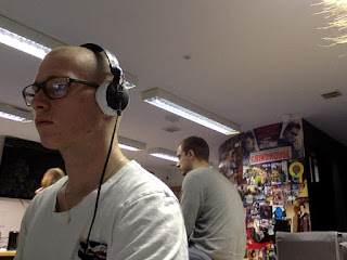

sneaky picture of Jacky in action, with Ollie coming in today with a new haircut and a new attitude

After reviewing our video and what we've done so far, watching it the whole way through. The group would say that we are pleased with the progress that we have made throughout the past few weeks, and feel as if we are slowly getting there. The footage we got on our shoot day has deemed itself to be sufficient in order for us to make the music video that we will want to be our final product. It is going to be a long process with all the things such as after effects that we want to add as well, but we need to finish the actually video itself first. The good thing is that we all still seem to be enjoying this whole process and luckily are not yet bored of listening to the same song on repeat for the last few months. We are hoping the have fully completed our full first rough cut by the latest at the end of next week. Then when its done we will export it as a Quicktime file and then upload it to YouTube.
Thanks for the post, Tyler.
Subscribe to:
Posts (Atom)